
Find and view dashboards and reports


Find and view dashboards and reports

Completed

Scenario

Congratulations. You're the new sales manager at a clothing manufacturing company named Van Arsdel. Your first assignment is to view your sales and marketing dashboard and reports.

Procedure

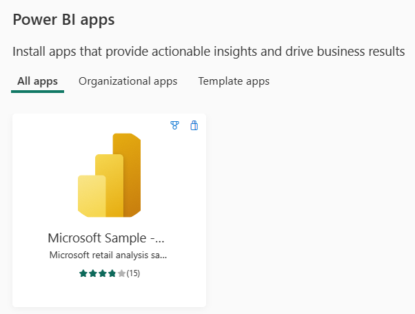
Add the Sales and Marketing Sample app

 Note

To add an app, you need Power BI. You can try Power BI for free.

  1. Sign in to https://app.powerbi.com.

  2. Select the Apps tab on the nav bar.

  3. Select the Get apps button.

  4. Search for Sales & Marketing.

    Screenshot of the sample app for this lab.

  5. Select the app and choose the Get it now link.

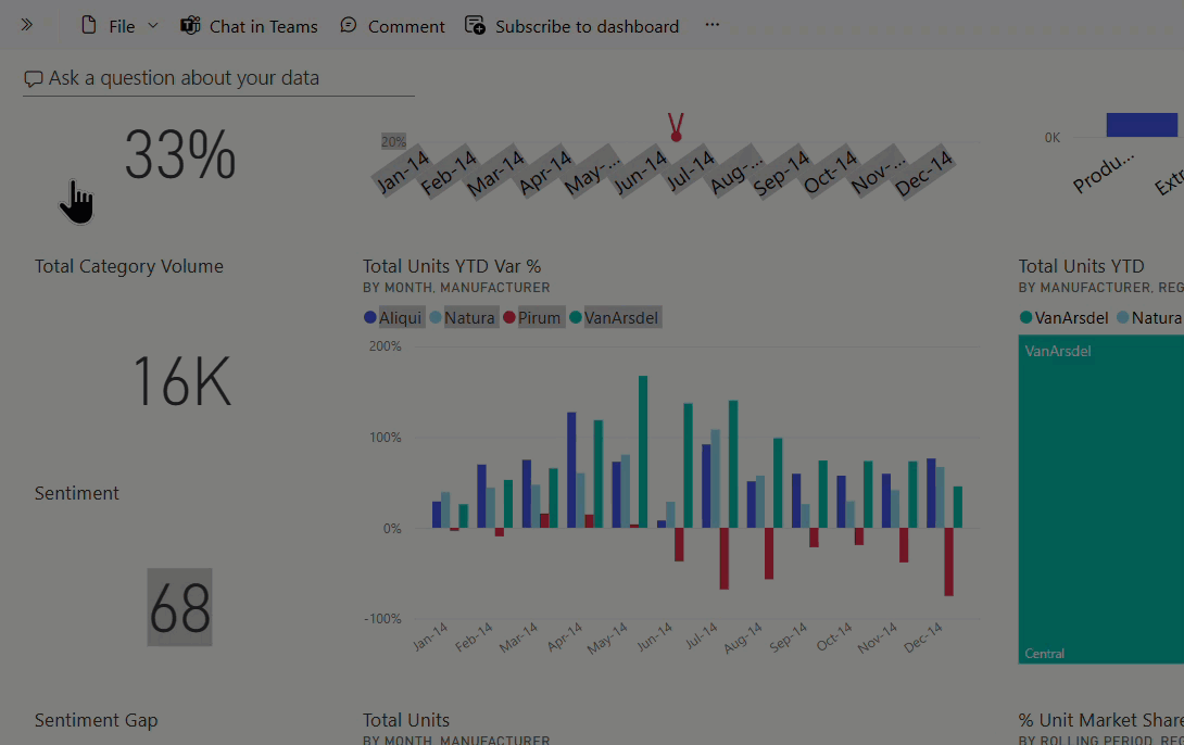
Open and view the dashboard and report

  1. Select the app to open the Marketing and sales app dashboard.

  2. Select one of the column chart or line chart tiles to open the detailed report.

  3. To return to the dashboard, select the back arrow of your browser.

    Animation of moving between dashboards and reports.

Create an alert

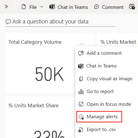
  1. From the Marketing and sales app dashboard, mouse over the Total Category Volume tile (the upper left corner of the canvas), and select the ellipses (…).

  2. Select Manage alerts.

    Screenshot that shows the Manage alerts option.

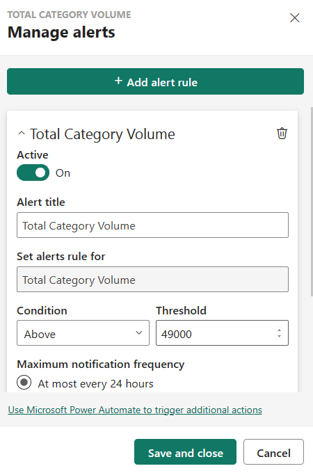
  3. Select + Add alert rule.

  4. Scroll down to the Threshold field and type in 49000.

  5. Select the checkbox for At most every 24 hours.

  6. Select the checkbox for Send me email, too.

  7. Select the Save and close.

    Screenshot that shows how to add an alert rule.

 Note

Since total category volume is already above 49,000, you will receive an email within 24 hours.

Add a comment on your dashboard

  1. Mouse over the Total Units tile (top right), select the ellipses (…), and then select Add a comment.

    Screenshot that shows how to add a comment.

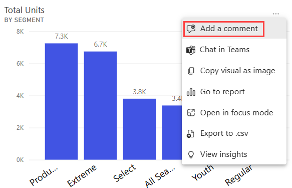
  2. Add a comment to the visual tile like, "Should we include the Winter segment here?"

  3. Select the Post and then Close.

  4. Next to the Total Units title, select the conversation icon that just appeared to see your comment.

Report and accessibility display options

Reports are viewed on many different devices, with varying screen sizes and aspects. The View menu has many options that control how your report page displays. Select the option that works best for your screen size, your audience, or your personal preference. Try the following steps:

  1. Select the Total Units tile to open the associated report.

  2. From the upper menubar, select the View menu.

    Image of the options under the View menu.

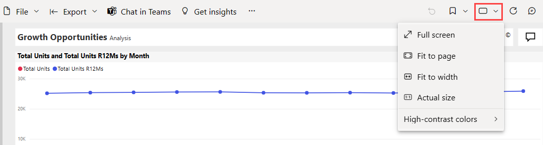
  3. The first three options control the display of your report. Select each of the three options to learn how they work.

    • To display your report page at the largest size possible without resorting to scrollbars, select Fit to page.
    • To fill the entire width of the available space. Select the Fit to width.
    • To view the report at the best resolution (and if you don’t mind the possibility of double scrollbars), select Actual size.
  4. There are several accessibility settings available from the View menu. These settings make reports easier to consume by people with color blindness or other sight challenges. From the View menu, select High contrast colors and choose one of the options.

Comments

Popular posts from this blog

Compare Power BI Desktop and the Power BI service

  Power BI Desktop  is a free application that you download and install on your local computer. Desktop is a complete data analysis and report creation tool that is used to connect to, transform, visualize, and analyze your data. It includes the Query Editor, in which you can connect to many different sources of data, and combine them (often called modeling) into a data model. Then you design a report based on that data model. Reports can be shared with others directly or by publishing to the Power BI service. Sharing reports requires a Power BI Pro license. The  Power BI Desktop getting started guide  walks through the process. The  Power BI service  is a cloud-based service, or  software as a service  (SaaS). It supports report editing and collaboration for teams and organizations. You can connect to data sources in the Power BI service, too, but modeling is limited. The Power BI service is used to do things such as creating dashboards, creating...

Getting started with Power BI

Getting started with Power BI Find insights in your data and share rich analytics reports. Begin your Power BI free trial within Microsoft Fabric and experience the next generation of data analytics. Try for free   What you can do with Power BI Discover relevant reports Sign up for Power BI  to find relevant content—including reports you built and pre-existing reports from your organization and others. Learn how Uncover report insights Explore your reports to find and generate the  quick insights  you need for better business decisions. Learn how Share insights Collaborate on reports with colleagues, then easily share reports and insights in workspaces, on the web, in apps, via Microsoft Teams. Learn how Connect to data Easily import your data from wherever it is—Excel workbooks, local databases, or the cloud—and transform it so it’s ready to analyze. Learn how Build a report Create and format visuals that present your data story in compelling and insightful ways usi...

View content in the Power BI service

  View content in the Power BI service Completed In Power BI, the term  content  refers to apps, dashboards, and reports. Content is created by Power BI designers, who share it with colleagues like you. Your content is accessible and viewable in Power BI, and the best place to start is your Home canvas. Explore Power BI Home When you sign in, Power BI opens and displays your Home canvas. Power BI Home offers three ways of locating and viewing your content. Though all three access the same pool of content, they're merely different ways of getting to that content. Occasionally, searching is the easiest and quickest way to find something. Other times, selecting a tile on the Home canvas is your best option. The Home canvas displays and organizes your favorite and most recent content, along with recommended content and learning resources. Each piece of content displays as a tile, with a title and icon. Selecting a tile opens that content. The global search box lets you search...